First Graph
Table of Contents
Show Graph
import matplotlib.pyplot as pltNow we can define what we want to plot. One of the most accessible plots you can create with Pyplot is a plot of just two lists x and y which we can define as follows
x = [1, 2, 3, 4, 5]
y = [1, 4, 9, 16, 25]
Of course, both lists must have equal lengths. Here, we have just chosen an arbitrary quadratic relation between x and y, but of course, you can play around with it by changing these values to see what happens. Plotting these lists with Pyplot can simply be done by writing
plt.plot(x, y)And finally, in the last step, we want to draw the graph with the function
plot.show()We can see now a canvas opening with a parabolic graph appearing. Of course, the number of samples is limited and thus the result is not very smooth, but in general, you can plot any list or array with the help of this method. The full code is shown below:
import matplotlib.pyplot as plt

x = [1, 2, 3, 4, 5]
y = [1, 4, 9, 16, 25]

plt.plot(x, y)
plt.show()
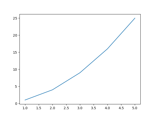 First graph with matplotlib
Adding Title & Labels
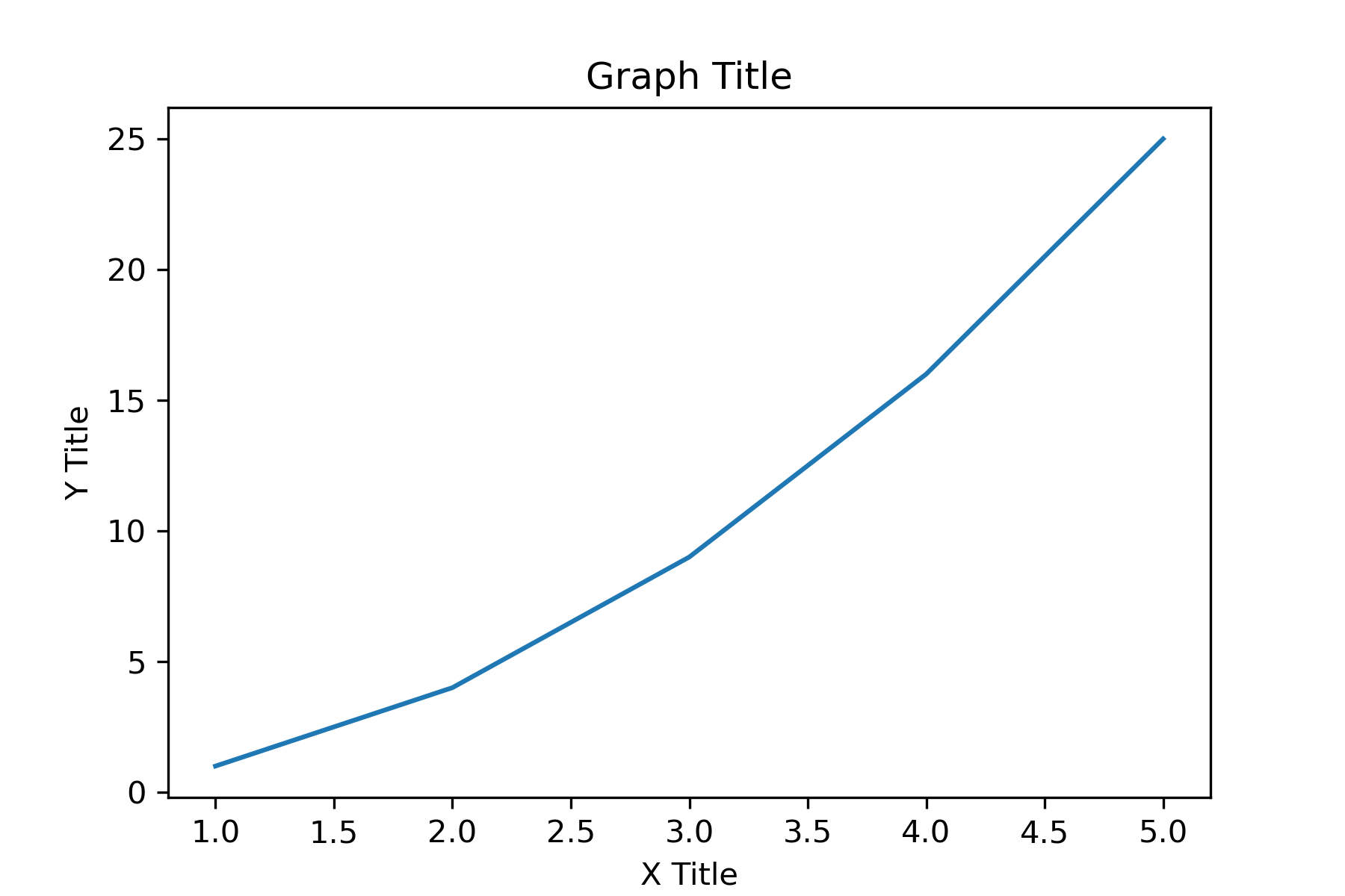
plt.xlabel('X Title')
plt.ylabel('Y Title')
We can also add a title to our graph by writing
plt.title('Graph Title')
Our code looks now as follows:
import matplotlib.pyplot as plt

x = [1, 2, 3, 4, 5]
y = [1, 4, 9, 16, 25]

plt.xlabel('X Title')
plt.ylabel('Y Title')

plt.title('Graph Title')

plt.plot(x, y)
plt.show()
Adjusting Size
fig = plt.figure(figsize=(6,4))You can play around with these values to find out which are most suitable for your application such as scientific paper, presentation, or thesis. After adding this line our code looks like that. In some cases, the axes' titles or labels are cut off by the border of the figure. It is thus always recommended to add the line
plt.tight_layout()before plotting the graph to make sure that matplotlib adjusted the plot size to the figure size.
import matplotlib.pyplot as plt

x = [1, 2, 3, 4, 5]
y = [1, 4, 9, 16, 25]

fig = plt.figure(figsize=(6,4))

plt.xlabel('X Title')
plt.ylabel('Y Title')

plt.title('Graph Title')

plt.tight_layout()

plt.plot(x, y)
plt.show()
 Graph with adjusted figure size.
Saving Graph
plt.savefig('graph.pdf')
which takes the filename as a string as the first argument. You can either chose a bitmap format such as PNG or a vector format like PDF. In the case of PNG, we can additionally add the argument dpi=XXXdpi where XXXX stands for the desired resolution. Let us therefore export it as both formats. In this case, the function show() can me ommited as shown in the code below:
import matplotlib.pyplot as plt

x = [1, 2, 3, 4, 5]
y = [1, 4, 9, 16, 25]

fig = plt.figure(figsize=(6,4))

plt.xlabel('X Title')
plt.ylabel('Y Title')

plt.title('Graph Title')

plt.plot(x, y)

plt.tight_layout()

plt.savefig('graph.pdf')
plt.savefig('graph.png', dpi=300)
This page contains 790 words and 4734 characters.


Last modified: 2022-10-01 18:33:07 by mustafa