Plotting Functions
Table of Contents
Creatng Plots
import matplotlib.pyplot as pltNow we want to define our functions with the help of the numpy package which we will additionally include:
import numpy as npWe want to plot 2 functions f and g simultaneously. The first one we will define as a square root function in the following way:
def f(x):
    return np.sqrt(x)
The second one should be a periodic sine function:
 def g(x):
    return np.sin(x)
For the x-coordinate, we create 1000 values between 0 and 5 using the function linspace from the numpy package:
x = np.linspace(0,5,1000)This is of course arbitrary and can be changed for testing purposes. Now we have to define the arrays for two y-coordinates as a function of x:
y1 = f(x)
y2 = g(x)
Similar to the previous chapter, we can now create a new figure and define the figure size using the following lines of code:
plt.plot(x,y1,color='r',linestyle='dashed')
plt.plot(x,y2,color='b',linestyle='dotted')
Here, x is the array of x-values, and y1 and y2 are the previously defined arrays for the y-coordinates. The argument color changes the line color to red for the first graph and blue for the second one. The line style is additionally changed to dashed for the first and dotted for the second plot. In the end, we want to add
plt.tight_layout()to make everything fit into the window. The full code now looks as follows:
import matplotlib.pyplot as plt
import numpy as np

def f(x):
    return np.sqrt(x)

def g(x):
    return np.sin(x)

x = np.linspace(0,5,1000)
y1 = f(x)
y2 = g(x)

fig = plt.figure(figsize=(4,3))
plt.plot(x,y1,color='r',linestyle='dashed')
plt.plot(x,y2,color='b',linestyle='dotted')
plt.tight_layout()
plt.show()
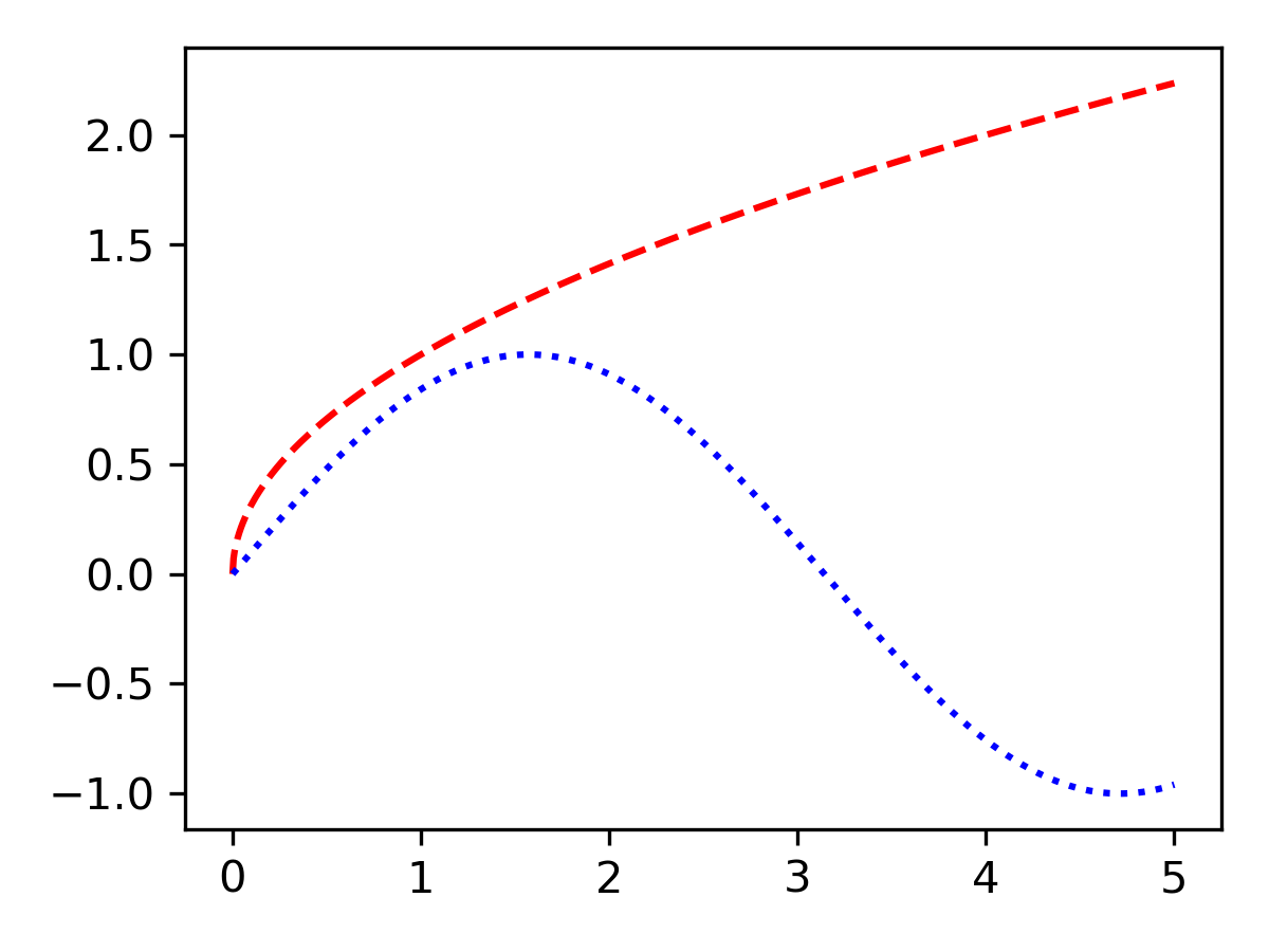 Creating plot window with two graphs.
Adding Legend
plt.plot(x,y1,color='r',linestyle='dashed',label='plot1')
plt.plot(x,y2,color='b',linestyle='dotted',label='plot2')
The labels plot1 and plot2 are of course again arbitrary names and can be changed if necessary. Finally, only the function legend has to be inserted before the graphs are shown. One argument of legend() is the location which will be now set to "lower left" to adjust the position of the legend. If this argument is kept empty, the legend will be positioned automatically where it fits best. The full code is again inserted below:
plt.tight_layout()to make everything fit into the window. The full code now looks as follows:
import matplotlib.pyplot as plt
import numpy as np

def f(x):
    return np.sqrt(x)

def g(x):
    return np.sin(x)

x = np.linspace(0,5,1000)
y1 = f(x)
y2 = g(x)

fig = plt.figure(figsize=(4,3))
plt.plot(x,y1,color='r',linestyle='dashed',label='plot1')
plt.plot(x,y2,color='b',linestyle='dotted',label='plot2')
plt.legend(loc='lower left')
plt.tight_layout()
plt.show()
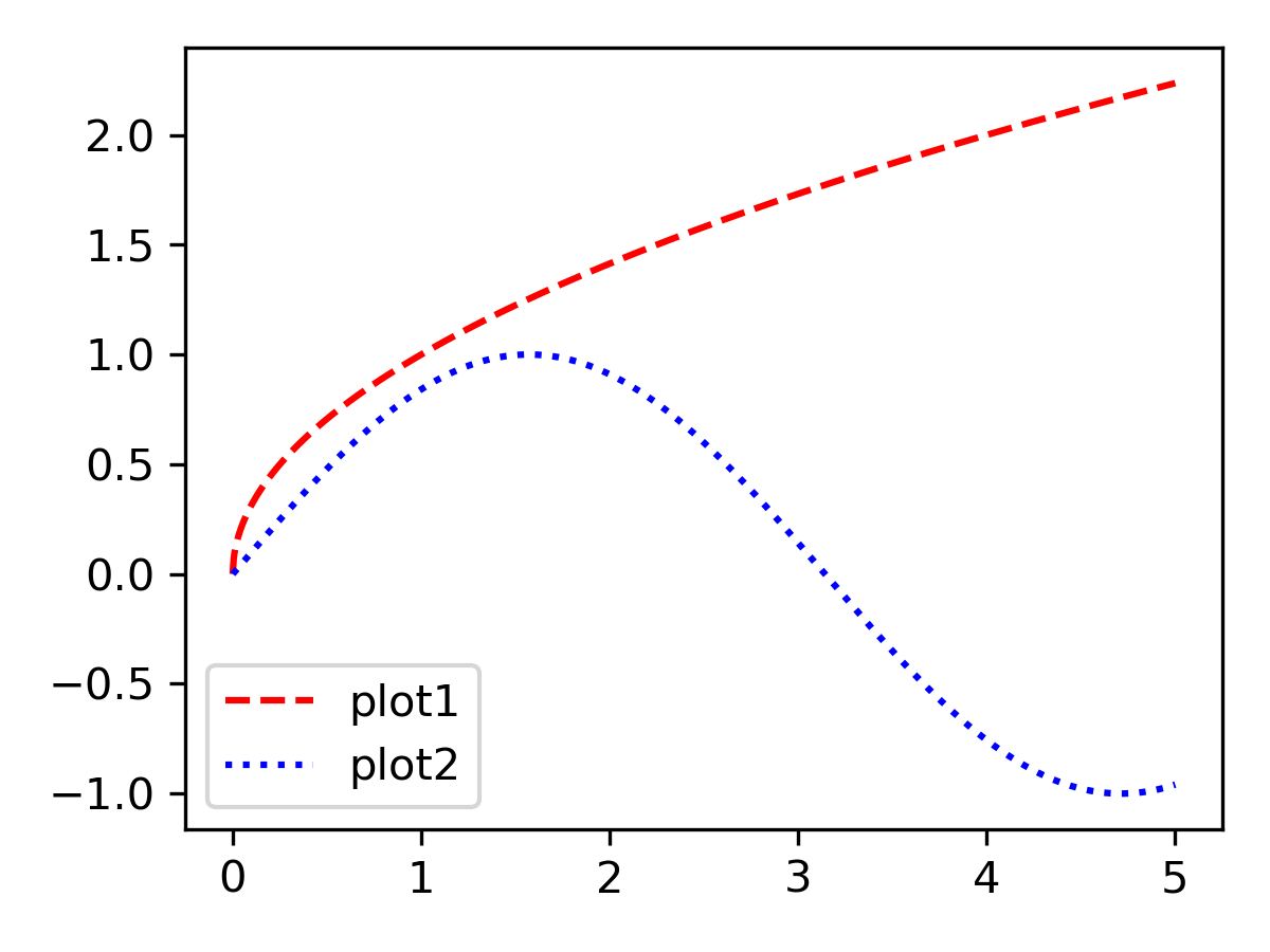 Adding legend to plots.
Defining Axes Limits
ax = plt.gca()The axes are now stored within the object ax. Now we can set the limits in the following way:
ax.set_xlim(1,4)
ax.set_ylim(0,2)
We would additionally like to add some axes labels for the x-axis and y-axis as explained in the previous unit. And again, the full code will now be presented:
 import matplotlib.pyplot as plt
import numpy as np

def f(x):
    return np.sqrt(x)

def g(x):
    return np.sin(x)

x = np.linspace(0,5,1000)
y1 = f(x)
y2 = g(x)

fig = plt.figure(figsize=(4,3))
plt.plot(x,y1,color='r',linestyle='dashed',label='plot1')
plt.plot(x,y2,color='b',linestyle='dotted',label='plot2')
plt.xlabel('x')
plt.ylabel('y')
ax = plt.gca()
ax.set_xlim(1,4)
ax.set_ylim(0,2)
plt.legend(loc='lower left')
plt.tight_layout()
plt.show()
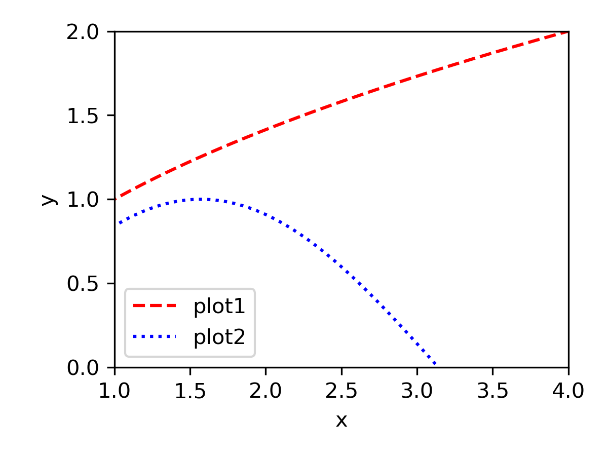 Final plot containing two functions, axes limits, and a legend.
This page contains 948 words and 5493 characters.


Last modified: 2022-10-01 18:33:29 by mustafa